 USD
USD
 EUR
EUR
 AUD
AUD
 GBP
GBP
 SGD
SGD

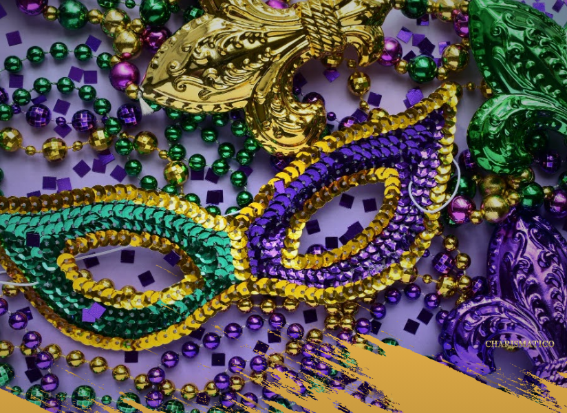
Color Theory for Mardi Gras: Making Purple, Green & Gold Pop in Your Costume
Mardi Gras is a celebration built on color. Purple, green, and gold transform every street into a living stage, and each shade carries its own story. Performers rely on these colors to express mood, movement, and meaning, yet blending them well can feel challenging. Too much of one tone can flatten the costume. Too little contrast can make details disappear in the crowd.
In this, we guide explore how to use Mardi Gras color theory with confidence. We look at the symbolism behind each shade, how these colors interact under parade lights, and how to apply them across feathers, fringe, sequins, and accessories. With the right approach, purple, green, and gold do more than look festive. They shape the rhythm of your costume and bring your performance to life.
Understanding the Meaning Behind Mardi Gras Colors
Purple for Justice
Purple carries weight. It feels regal and mysterious, which is why it shapes so many dramatic Mardi Gras pieces. A deep violet headdress or a structured shoulder piece instantly adds authority to a look. Lighter purples soften the costume and bring a dreamlike quality to featherwork. Performers often use purple to frame the upper body because it draws the eye upward and reinforces strong posture on the parade route.
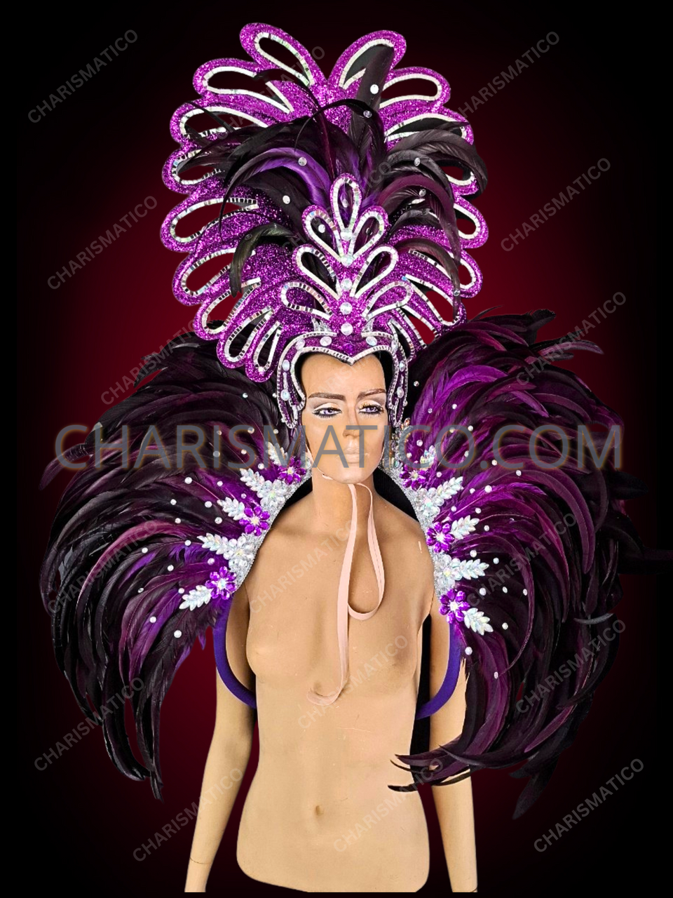
One of our purple feathered Mardi Gras headdresses with sequins and crystal trim, perfect to shine under stage lights.
Mardi Gras headdress with deep violet feathers and crystals
Green for Faith
Green brings life into the design. It has energy. It has freshness. When used in feathers or fringe, it introduces movement that feels vibrant and bright. Green also sits comfortably between warm and cool tones, which makes it a natural partner for both gold and purple. Even a small amount of emerald or lime can lift the entire palette and give the costume more dimension.
Gold for Power
Gold never whispers. It shines. It reflects. It announces itself before you even step onto the street. Parade lights love gold because it throws brilliance in every direction. Sequins, metallic appliqués, and gilded accessories help create that loud, radiant effect Mardi Gras is known for. The key is placement. Gold works best as the highlight. It draws attention to motion points like hips, shoulders, and wings.
How These Colors Work Together
Purple, green, and gold were chosen for a reason. Together they balance depth, brightness, and brilliance. One brings mystery. One brings vitality. One brings shine. The combination creates a palette that holds strong even in crowds full of competing colors. For those new to styling Mardi Gras pieces, our guide on what to wear during Mardi Gras offers an easy introduction to building outfits around these iconic hues.
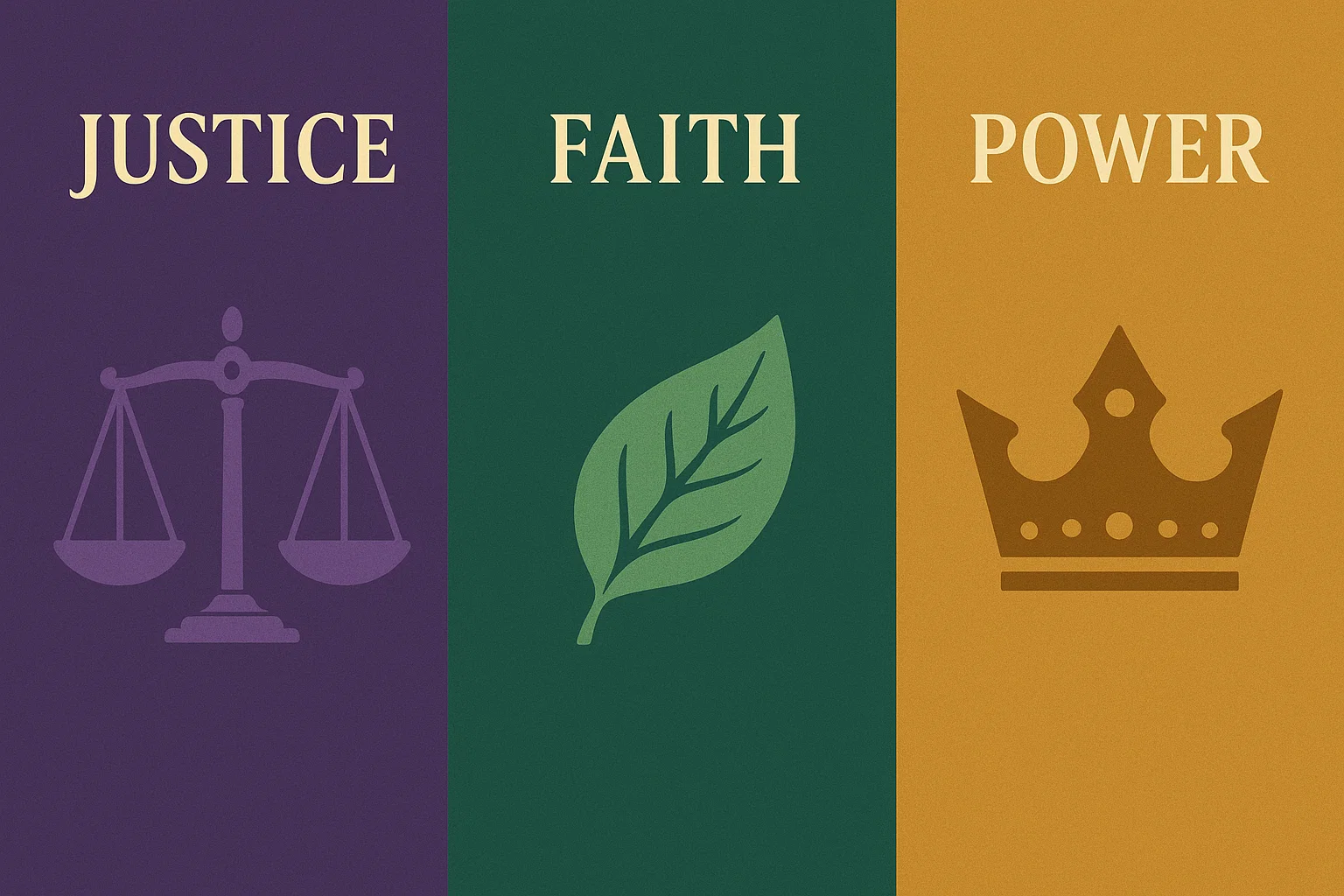
Each hue carries symbolism: justice in purple, faith in green, and power in gold.
Infographic showing meanings of purple, green, and gold for Mardi Gras: justice, faith, and power.
Applying Color Theory to Costume Design
Choosing a Dominant Color
Every strong Mardi Gras costume starts with one leading shade. It keeps the design grounded. It gives the eye a place to rest. Some performers choose gold as the anchor because it commands attention from a distance. Others prefer purple for mood or green for movement. Once the dominant color is set, the rest of the palette becomes easier to control. A strong base stops the costume from feeling crowded and helps every accent fall into place.
Creating Contrast Through Placement
Contrast is what makes a costume visible from across the parade route. Dark purples glow when paired with bright gold. Fresh greens become richer next to deep violets. Think about where your body moves the most. Shoulders. Hips. Wings. These are perfect locations for contrast because each step sends a ripple of color through the crowd. Placing gold at key movement points also helps the costume sparkle under lights. Our Mardi Gras outfits collection shows many examples of designs that use contrast to enhance motion.
Playing with Shade Variations
Color theory is not only about choosing purple, green, and gold. It is also about choosing the right version of each. A soft lavender creates a very different mood from a dark amethyst. Emerald brings drama, while lime adds excitement. Matte gold feels warm and subtle. Metallic gold feels bold and explosive. Adjusting shade and finish lets performers tailor the emotion of the costume to their own energy.
Highlighting Texture Through Color
Textures change how colors appear in motion. Feathers soften and diffuse color. Fringe creates streaks and flashes as you move. Sequins reflect light in sharp bursts. Combining these textures prevents the costume from feeling flat. A purple feather cape can sit beautifully against a green sequined bodysuit. Gold fringe can add flowing highlights that spark with each turn. When texture and color work together, the costume feels alive.

Green brings energy and rhythm, catching light with every sway.
Green fringe fabric capturing the Mardi Gras bright lights.
Making Purple, Green, and Gold Pop on the Parade Route
Understanding Light Behavior
Light transforms Mardi Gras costumes. Streetlights warm the tones. Spotlights sharpen metallics. Sunlight softens feathers. Gold thrives in almost any lighting because it reflects so intensely. Purple deepens as the light drops, giving the costume a rich, theatrical quality. Green tends to shift depending on its finish, which makes it useful for creating both bright highlights and smoother transitions. Testing your costume under different lighting helps you see how each color will actually perform during the parade.
Movement and Color Flow
Movement brings the palette to life. A gradient of green to gold feels electric when fringe starts to sway. Purple feathers create soft waves that make turns look wider and more dramatic. Color placement matters. When the most vivid shades sit near the points of motion, the audience sees the costume come alive with every step. Performers who use wings or flowing capes can also take advantage of this by blending colors from the base outward. It creates a ripple effect that reads beautifully from a distance.
Balancing Color Distribution
A Mardi Gras palette can become overwhelming quickly. Spacing out the colors keeps the design readable. Some performers use the 60-30-10 rule. One tone leads. One supports. One highlights. Purple may dominate the bodice while green strengthens the wings. Gold can then add concentrated shine across accessories, headdresses, or belts. It is a simple structure, but it keeps the colors vibrant rather than chaotic. For accessory inspiration, our article on headdresses, belts, wings, and accessories for Mardi Gras offers ideas on how small pieces can help balance the palette.
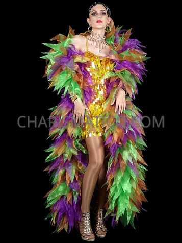
Mardi Gras is your chance to test different styles and colors and embrace the carnival atmosphere, such as with this Mardi Gras boa
Our Mardi Gras three-toned leafy organza boa
Let Your Mardi Gras Colors Take Center Stage
Purple, green, and gold do more than decorate a costume. They create emotion. They shape movement. They tell the story of Mardi Gras with every step you take. When used with intention, these colors balance each other beautifully. Purple brings depth. Green brings life. Gold brings brilliance. Together they form a palette that feels timeless and powerful.
Designing with these colors becomes easier once you choose a dominant shade, layer supporting tones, and allow texture to guide how the palette moves. Wings, headdresses, belts, bodysuits, and jewelry all carry color differently, so testing them in light and motion helps bring the look into focus. Small shifts in placement can transform a costume from good to unforgettable.
At Charismatico, we use these principles every day when creating performance pieces. Many of our Mardi Gras outfits show how purple, green, and gold can blend into designs that feel bold yet balanced.
Color Magic in a Snapshot
- Purple, green, and gold each carry unique meaning and energy that shape the emotion of a Mardi Gras costume.
- Choose one dominant color to anchor the design, then use the other two as support and highlight tones.
- Contrast and placement matter. Bright colors placed at movement points help the costume come alive on the parade route.
- Texture changes how colors behave. Feathers soften, fringe energizes, and sequins reflect light dramatically.
- Testing your costume under different lighting reveals how shades shift during nighttime parades or stage performances.
- Accessories like headdresses, wings, belts, and jewelry bring cohesion to the palette and complete the overall look.